08Time as a Material: Motion, Latency, and Feedback
09Dense Interfaces: Tables, Filters, and Dashboards
10Deep Accessibility: Semantics, Focus, and Conformance
11One Product, Many Contexts: Language, Theme, and Platform
12Above the Screen: Strategy, Ethics, and Design at Scale
Final exam
Certificate
48 topics · ~11h
Accredited Curriculum & Certification
Official Syllabus Snapshot
Direct Answer: Learn to design interfaces people can actually use — from the first user interview to a tested, accessible, production-ready design system.
Tuition Fee
100% Free
Duration & Workload
~11 Hours
Curriculum Depth
12 Chapters · 48 Lessons
Credential Awarded
Verified Certificate
12Chapters
Course outline
Finding out what users actually do, and turning those findings into personas and journey maps that settle arguments.
Interviews That Produce Facts, Not Flattery14 min
Personas That Can Settle an Argument13 min
Journey Maps and Where the Pain Actually Is13 min
Synthesis: Turning 400 Notes Into Six Insights13 min
Information architecture, task flows, and wireframes — deciding what goes where before anything gets styled.
Information Architecture and Card Sorting13 min
Task Flows and the States Nobody Designs12 min
Wireframing at the Right Fidelity14 min
Navigation Shells and the Cost of a Hamburger13 min
Making the eye move in the right order, on a type and spacing system, in colours everyone can read.
Visual Hierarchy: Directing the Eye13 min
Type and Spacing Scales14 min
Colour and Contrast You Can Prove15 min
Depth: Shadows, Borders, and Elevation13 min
Tokens, components and prototypes — turning one-off screens into a system a team can build from.
Tokens: The Vocabulary of a System13 min
Components, Variants, and Auto Layout in Figma15 min
Prototyping Interactions Worth Testing13 min
File Structure, Branching, and Version History13 min
Proving the design works, making sure everyone can use it, and getting it built the way you designed it.
Usability Testing That Changes the Design14 min
Accessibility as a Design Constraint15 min
Critique, Handoff, and Measuring the Result13 min
Finding Five Participants Who Are Actually Your Users13 min
One interface that survives every screen size, and the microcopy and form craft that carry most of its usability.
Breakpoints, Fluid Type, and Container Queries14 min
Microcopy: The Words Are the Interface13 min
Forms People Actually Finish14 min
Images That Fit Every Screen Without Wrecking the Layout13 min
Auditing the real build, measuring the change with numbers, and running a design system into its second year without it rotting.
Design QA: Auditing the Build in the Browser14 min
A/B Tests That Do Not Fool You14 min
Design Debt, Governance, and Deprecation13 min
Rolling Out a Redesign Without a Revolt13 min
Designing what happens between a tap and a result, so movement, waiting and feedback read as intentional rather than as something broken.
The Physics of Motion: Easing, Duration, and Distance13 min
Choreography: Transitions That Explain What Just Happened12 min
Designing the Wait: Skeletons, Spinners, and Perceived Speed13 min
Slow and Streaming Systems: Progress, Partial Results, and Cancelling14 min
Designing the data heavy screens people work in all day, where thousands of rows, stacked filters and bulk actions still have to stay readable, honest and safe.
Data Tables That Survive Ten Thousand Rows13 min
Search, Filters, and Facets Without a Dead End13 min
Bulk Actions, Destructive Choices, and Undo13 min
Dashboards People Act On, Not Just Look At13 min
Going past the contrast checker into what assistive technology actually consumes, and into the audits and standards a shipped product gets judged against.
The Accessibility Tree: What a Screen Reader Actually Announces14 min
Keyboard and Focus: Modals, Menus, and Complex Widgets14 min
Zoom, Reflow, and Hit Targets: The Criteria Designers Own13 min
Audits, VPATs, and Fixing a Product You Inherited13 min
Holding one design system together across languages, writing directions, brands and native platforms without quietly forking it into four separate products.
Localisation: Text Expansion, Names, Dates, and Currency13 min
Right to Left: Mirroring a Layout Without Breaking It12 min
Dark Mode and Multi-Brand Theming Through Token Tiers14 min
iOS, Android, and Web: When to Follow the Platform and When Not To13 min
The work that decides which interfaces get made at all, who they serve, and how a design practice holds its quality across many teams and several years.
Design Strategy: Choosing What Not to Build13 min
Influence Without Authority: Getting the Decision Made13 min
Dark Patterns and Consent: The Line You Do Not Cross13 min
Design Ops: Twelve Designers, One Coherent Product13 min
Final exam & certificate
01
Topic checks
Each one opens the next topic
02
Chapter quizzes
Each one opens the next chapter
03
50-question final
50 of 100 marks to pass
04
Certificate
Issued instantly, verifiable
One attempt, 60 minutes. If you don't pass, you can retake once after 30 days.
The course guide
How to learn UI UX design for free: an 8 week roadmap
16 October 2026 · 10 min read
You can learn UI UX design for free if you learn it in the order the work actually happens: talk to users first, decide the structure second, style the screens third, and test with real people before you call anything finished. Most beginners do it backwards: they open Figma, copy a pretty app from Dribbble, and end up with screens that fall apart the moment someone uses them. Figma is free to start with, and the thinking costs nothing but practice.
This guide gives you an 8 week roadmap, the portfolio projects that prove you can do the job, the mistakes that make reviewers close a case study, and an honest look at our free UI/UX Design Bootcamp, chapter by chapter.
UI and UX are two halves of one job
People search for "UI UX" as one word because in most small teams, one person does both.
UX (user experience)
UI (user interface)
Question it answers
Does this solve the right problem, in the right order?
Hierarchy, type scale, spacing, colour, components, prototypes
What goes wrong without it
A beautiful screen for a problem nobody has
A correct flow that nobody can read or tap
Main output
Evidence and structure
A design system a developer can build
You need both. A UX designer who cannot make a readable screen gets ignored, and a UI designer who cannot explain why a screen exists gets overruled.
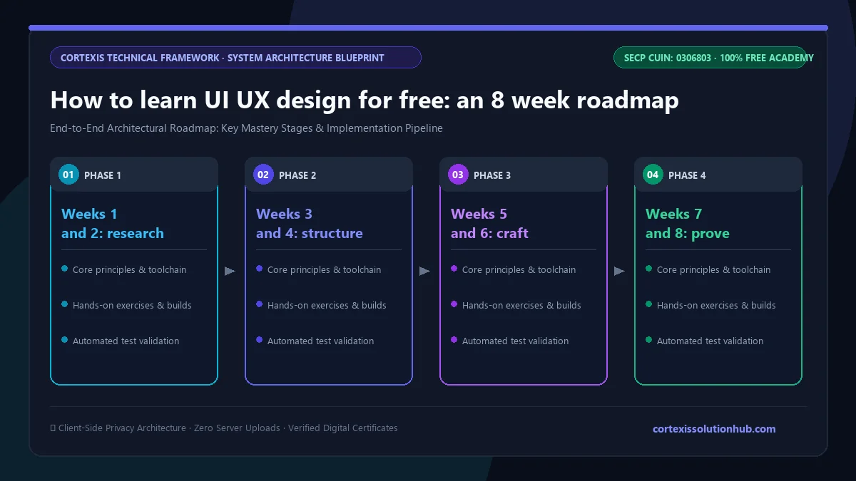
Figure 1: Complete step-by-step architectural workflow and technical execution stages for How to learn UI UX design for free: an 8 week roadmap.
What you need before you start
Less than you think.
A computer and a browser. Figma runs in the browser and its free plan is enough for learning.
Paper and a pen. Early sketches are faster on paper.
Three to five real people you can talk to. You cannot practise interviewing alone.
No drawing talent. UI work is boxes, type and spacing on a grid. Nobody hires you for your sketches.
An 8 week roadmap to learn UI UX design for free
Plan for about an hour a day. Each week ends with something you can show.
Week
Focus
What you finish
1
User interviews and synthesis
Five interviews and a short list of insights with participant IDs
2
Personas and journey maps
One primary persona and a journey map showing where users drop off
3
Information architecture and task flows
A sitemap and flows that include error and empty states
4
Wireframes
Mid fidelity mobile wireframes with real text, no colour
5
Visual design
A type scale, a spacing scale and a colour palette that passes contrast checks
6
Figma components and prototype
Components built with auto layout, and a clickable prototype
7
Usability testing
Five test sessions and a list of fixes, ranked
8
Accessibility, handoff and case study
A revised design, developer notes and a written case study
Weeks 1 and 2: research first
Interview people about the last time they did the thing your product helps with, not about what they would like in future. "Would you use this?" gets a polite yes from everyone. "Tell me about the last time you tried to keep up with an online course" gets real details, including the workarounds people invent, which are the best evidence of a real need. Turn your notes into a persona built on behaviour, not age and hobbies, and a journey map that shows where people actually give up.
Weeks 3 and 4: structure before pixels
Decide what goes where before you choose a single colour. Sketch a task flow for each main job, and draw the states nobody thinks about: the empty screen on first visit, the failed payment, the expired link. Then wireframe at mid fidelity, with real headings and real spacing but no colour, so reviewers argue about the flow instead of the button radius. Design the narrow mobile frame first, because squeezing a finished desktop layout down forces cuts nobody wants to make.
Weeks 5 and 6: craft and system
Pick a type scale and a spacing scale and stick to them. Check every text and background pair against WCAG contrast; at the AA level, normal body text needs at least 4.5 to 1. In Figma, learn auto layout properly (it behaves much like CSS flexbox), build components with variants, and link a few screens into a prototype that is good enough to test.
Weeks 7 and 8: prove it works
Give five people a task, stay quiet, and watch where they hesitate. Fix the worst problems, check keyboard and screen reader basics, write handoff notes, then write it all up as a case study.
Portfolio projects that actually prove something
A reviewer wants to see your reasoning, not just your final screens. Pick a real problem close to you:
A local service redesign. A clinic booking flow, a school fee portal, or a small shop's ordering page. Interview the people who use it.
A mobile app for a habit you know. Studying, saving money, tracking a cricket team's practice. Keep the scope to one core task done very well.
A dashboard or data heavy screen. Harder, and rarer in junior portfolios.
For each one, show the problem, what you learned from users, the options you rejected and why, the test results, and what you changed. One honest case study beats five Dribbble copies.
Mistakes that slow beginners down
Starting in high fidelity. Polished screens hide bad flows.
Asking users what they want. Ask what they did last time instead.
Designing only the happy path. Developers will improvise the missing error screens, usually as a raw error message.
Using a hamburger menu for everything. Hidden navigation gets used less. On mobile, three to five clear tabs usually serve people better.
Light grey text on white. It looks elegant and fails contrast.
Skipping testing because you are sure. Everyone is sure until the first session.
What the free UI/UX Design Bootcamp covers
The UI/UX Design Bootcamp is a beginner level course with 12 chapters and 48 lessons. The first seven chapters are the core path; the last five go deeper into the kind of work you meet on a real product team.
Chapter
What you learn
1. Research and the People You Design For
Interviews that produce facts, personas that settle arguments, journey maps, synthesis
2. Structure Before Pixels
Information architecture and card sorting, task flows and edge states, wireframing, navigation
3. Visual Craft: Hierarchy, Type, and Colour
Visual hierarchy, type and spacing scales, colour and contrast, shadows and elevation
4. Design Systems and Figma
Design tokens, components and variants with auto layout, prototyping, file structure and branching
5. Testing, Accessibility, and Handoff
Usability testing, accessibility as a constraint, critique and handoff, recruiting participants
6. Responsive Layouts and the Words Inside Them
Breakpoints and fluid type, microcopy, forms people finish, responsive images
7. Shipping It and Keeping It Alive
Design QA in the browser, A/B tests, design debt and governance, rolling out a redesign
8. Time as a Material: Motion, Latency, and Feedback
Easing and duration, transitions, skeletons and spinners, progress for slow systems
9. Dense Interfaces: Tables, Filters, and Dashboards
Large data tables, search and filters, bulk actions and undo, dashboards people act on
10. Deep Accessibility: Semantics, Focus, and Conformance
The accessibility tree, keyboard focus in modals and menus, zoom and hit targets, audits
11. One Product, Many Contexts: Language, Theme, and Platform
Localisation, right to left layouts (useful for Urdu and Arabic), dark mode and theming, iOS and Android conventions
12. Above the Screen: Strategy, Ethics, and Design at Scale
Choosing what not to build, influence without authority, dark patterns and consent, design ops
The reading adds up to about 11 hours, but reading is not the work. With an hour a day spent doing the exercises on your own project, the 8 week estimate is realistic for the core chapters, and longer if you want to master the advanced ones.
Who it is for: complete beginners, graphic designers moving into product work, and developers who want their interfaces to stop confusing people. If you already make posters and logos, our graphic design for free guide covers the visual foundations that carry over. If you want to build what you design, the Frontend Engineering course is the natural next step, and the frontend developer roadmap shows how the two fit.
How the quizzes and free certificate work
Each topic has a minimum reading time of 90 seconds before its quiz opens, and you need 70 percent on that quiz to unlock the next topic. Each chapter also ends with a short quiz you must pass at 70 percent before the next chapter opens, and the final exam unlocks only when every topic and chapter quiz is done.
The certificate comes from the final exam: 50 questions, 60 minutes, one timed attempt, and you pass with 50 out of 100 marks. If you do not pass, a retake opens 30 days later with the questions and options reshuffled. Pass, and you get a free certificate with a verification code and a QR code anyone can check.
Be honest with yourself about what it proves. A hiring manager or client looks at your case studies first. The certificate shows you covered the fundamentals; your portfolio shows you can apply them. If you plan to take UI work on Upwork or Fiverr, the Freelancing: Upwork, Fiverr and LinkedIn course covers profiles, proposals, pricing and getting paid in Pakistan.
Start this week
Find three people, ask each one about the last time they struggled with an app or website they use often, and write down exactly what they say. That is week one of real UX work. Then start the free UI/UX Design Bootcamp and follow the roadmap above, one tested screen at a time.
Questions, answered
05 questions
Yes. The course, quizzes and certificate are free, and Figma's free plan is enough to practise. What you cannot skip is time with real users.
About 8 weeks at an hour a day gets you through the core skills and one solid case study. Becoming job ready usually takes a few more projects and honest feedback on them.
No. It helps to understand how layouts behave in a browser, which is why the course explains Figma auto layout in terms of CSS, but you can design well without writing code.
The tools are quick to pick up. The hard part is the habits: asking good questions, designing every state, and accepting what testing tells you.
Two or three case studies on real problems, each showing research, rejected options, test results and what you changed. Process matters more than polish.