
11 min read
Direct Answer: How to use Excel for data analysis, step by step. Clean data, write SUMIFS and XLOOKUP, build PivotTables and charts, then report. Free 12 chapter course.
- How to use Excel for data analysis, step by step. Clean data, write SUMIFS and XLOOKUP, build PivotTables and charts, then report. Free 12 chapter course.
- Authored by Umair with actionable, zero-fluff implementation guidance.
- Verified for immediate practical application, production workflows, and professional skill enhancement.
To use Excel for data analysis, you work in a fixed order: get the data into a clean table, answer questions with a small set of formulas (IF, SUMIFS, COUNTIFS, XLOOKUP), summarise it with a PivotTable, check the answer makes sense, and only then build a chart. Most people skip straight to the chart and the formulas, and that is where wrong numbers come from. The tools are not hard. The discipline is.
This guide walks through that order, the functions that do most of the real work, the mistakes that quietly break spreadsheets, and a realistic learning roadmap. It is built around our free Excel & Business Analytics course, which teaches all of it with one running sales dataset so each skill builds on the last.
Why Excel is still the place most data analysis starts
Python, SQL and Power BI get the attention, but in most offices in Pakistan the first place a number gets questioned is a spreadsheet. A sales manager in Lahore, an accountant in Karachi, a shop owner tracking stock on WhatsApp orders: they all send you an Excel file. If you can turn that file into a clear answer, you are useful on day one, before you know any programming.
Excel is also the best place to learn how analysis thinks. You can see every cell, every step, every mistake. That makes it a good teacher, even if you later move on to SQL for data analysis or a full data analyst bootcamp.
How to use Excel for data analysis in six steps
Here is the order an experienced analyst follows, whatever the question.
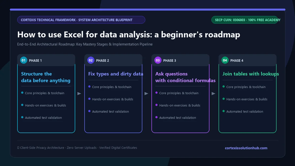
1. Structure the data before anything else
Analysis fails at the data stage far more often than at the formula stage. Keep to three rules:
- One fact per cell. "Ali Raza, Lahore" in one cell cannot be sorted by city.
- Headers in row 1, data below, nothing else on the sheet. Summaries go on a separate sheet.
- No blank rows inside the data. They break sorting, filtering and PivotTable ranges.
Then turn the range into an Excel Table (Ctrl+T). Tables grow when you add rows, so formulas and PivotTables pick up new data instead of silently ignoring it.
2. Fix types and dirty data
Numbers stored as text, dates that are really strings, trailing spaces in customer names: these are why a lookup returns nothing or a total looks too small. Check alignment (text sits left, numbers right), use TRIM and VALUE where needed, and look at the unique values in each column before you trust it.
3. Ask questions with conditional formulas
Most business questions are "how much, for which group?" That is SUMIFS and COUNTIFS:
=SUMIFS(Sales[Amount], Sales[City], "Lahore", Sales[Month], "March")
IF and IFS handle categories ("High" if over a target, "Low" otherwise). These few functions answer more real questions than any advanced feature.
4. Join tables with lookups
Your sales sheet has a product code, the price list is on another sheet. XLOOKUP joins them:
=XLOOKUP([@Code], Products[Code], Products[Price], "Not found")
It is the modern default. VLOOKUP still appears in old files, and it breaks when someone inserts a column, which is worth understanding before you inherit one.
5. Summarise with a PivotTable
A PivotTable turns thousands of rows into a summary in seconds: sales by city by month, top products, average order size. Drag fields into Rows, Columns and Values, and check the setting under Values (Sum, Count or Average) because the wrong one gives a confident, wrong answer.
6. Sanity check, then chart
Before you share anything, check that your PivotTable total matches the raw total, that counts look plausible, and that one odd row is not driving the result. Then pick the simplest chart that shows the point: a line for change over time, a bar for comparing groups. Start bar axes at zero.
The Excel functions that do most of the work
You do not need hundreds of functions. You need these, and you need to know when each one lies to you.
| Task | Function or feature | Watch out for |
|---|---|---|
| Lock a reference when copying | $G$1 or a named range | Missing $ turns totals into zeros with no error |
| Category from a rule | IF, IFS | Nested IFs nobody can read |
| Total or count by group | SUMIFS, COUNTIFS | Text that looks like a number is skipped |
| Join two tables | XLOOKUP | Keys with extra spaces never match |
| Summarise many rows | PivotTable | Count instead of Sum, stale refresh |
| Growth between periods | Simple % change | Comparing months with different day counts |
| Repeatable cleaning | Power Query | Source columns renamed next month |
| Many results from one formula | FILTER, SORT, UNIQUE | A spill blocked by a cell in the way |
Mistakes to avoid when analysing data in Excel
These come up again and again in real workbooks, and none of them shows an error message.
- Forgetting the
$. You write=C2*G1for commission, copy it down, and every row below the first multiplies by an empty cell. The sheet shows zeros, not an error. - Typing a number that should be calculated. A hardcoded total is wrong the moment data changes.
- Sorting one column instead of the whole table. Names and amounts get separated and nobody notices.
- Trusting an average. One very large order can pull the average far from what a typical customer does. Look at the median and the spread too.
- Comparing periods unfairly. A month with a holiday, or a shorter month, can look like a decline that is not real.
- Cleaning by hand every month. If you repeat the same fixes each time a new file arrives, Power Query should be doing it.
A learning roadmap: what to learn, and in what order
Learn in layers. Each layer is useful on its own, so you can stop at the one your job needs.
| Stage | What you learn | What you can do after it |
|---|---|---|
| Foundations | References, data types, clean structure, sorting and filtering | Build a sheet others can use without breaking it |
| Everyday analysis | IF, SUMIFS, COUNTIFS, text and date functions, lookups | Answer most routine business questions |
| Summaries and reporting | PivotTables, honest charts, what-if analysis, dashboards | Produce a monthly report a manager reads |
| Automation | Power Query, dynamic arrays, the Data Model | Refresh a report in minutes instead of rebuilding it |
| Deeper analysis | DAX measures, regression, forecasting, Solver | Answer questions a summary table cannot |
| Production | VBA, Office Scripts, Power Automate, Python in Excel, model review | Run spreadsheets a business depends on |
If your goal is a data analyst job, the first three stages plus Power Query cover a lot of what entry level roles ask about. Our guide on how to become a data analyst in Pakistan covers what to add after Excel.
What the free Excel & Business Analytics course covers
The course has 12 chapters and 48 topics, each a short reading of around 11 to 14 minutes with its own quiz. Every example uses the same sales dataset, so the formulas you write early are the ones you summarise, automate and model later.
- Foundations That Prevent Errors. Relative and absolute references, data types and dirty data, building a sheet others can use, and sorting without scrambling rows.
- Formulas That Do Real Work. IF and IFS, SUMIFS and COUNTIFS, text and date functions, percentages, growth and rank.
- Lookups. VLOOKUP and why it breaks, XLOOKUP, combining data from several sheets, and what to do when keys do not match.
- PivotTables and Analysis. PivotTable fundamentals, charts that tell the truth, what-if analysis and sanity checks, calculated fields and GETPIVOTDATA.
- From Spreadsheet to Analysis. Power Query basics, dashboards people actually use, communicating findings, and comparing periods without fooling yourself.
- Dynamic Arrays and Workbooks That Stay Fast. Spill formulas, why a workbook gets slow, taking over a file you did not build, and LAMBDA.
- Excel in Production. The Data Model, sharing a file without leaking it, running the monthly report, and connecting to a live data source.
- Power Query Beyond the Applied Steps. Writing M by hand, custom functions, a staging layer, and surviving refresh day failures.
- Models That Answer Harder Questions. Filter context, CALCULATE and ALL, iterators like SUMX and RANKX, and bridge tables.
- From Analysis to Decisions. Spread and outliers, correlation and regression with LINEST, seasonal forecasting, Solver and Monte Carlo simulation.
- Automation Beyond the Recorded Macro. Maintainable VBA, Office Scripts, Power Automate, and Python in Excel.
- When the Business Runs on Your Spreadsheet. Spreadsheet risk, testing a model, team standards, and migrating off Excel without losing the logic.
Chapters 7 and 9 overlap with Power BI, since the Data Model and DAX work the same way in both. If dashboards are your goal, the Power BI course is the natural next step.
Who it is for and how long it takes
The course is marked Beginner and starts from cell references, so you do not need prior experience. It suits students who want a practical skill for internships, office staff who already use Excel but keep hitting broken formulas, small business owners tracking sales and stock, and anyone preparing for a data analyst role.
We plan it as about six weeks at a steady pace, with roughly 10 hours of reading in total. Each topic stays open for at least 90 seconds before its quiz unlocks, and you need to pass a topic's quiz to move on, so it rewards reading properly rather than clicking through. You will get far more from it if you open Excel alongside and rebuild each example yourself.
One honest limit: reading about PivotTables does not make you good at them. Practice on a real file, ideally one from your own work or family business, is what turns the course into a skill.
How the free certificate works
The course ends in a final exam: 50 questions, 60 minutes, and a pass mark of 50 out of 100. You get one timed attempt. If you do not pass, a retake opens 30 days later with the same questions in a new order and the options shuffled. Leaving the page submits the exam, so pick a quiet hour. Pass, and the certificate is issued free.
The certificate shows you finished a structured course and passed a timed exam. It is not a Microsoft certification. Employers will be more convinced by a clean workbook you built and can explain in an interview. We wrote more about this in are free online certificates worth anything.
Questions, answered
06 questions
For many business questions, yes. Excel handles cleaning, lookups, summaries, charts and even regression and forecasting. It struggles with very large datasets and work that many people edit at once, which is where SQL, Power BI or Python take over.
Start with absolute references, IF, SUMIFS, COUNTIFS and XLOOKUP, then PivotTables. Those cover most everyday questions. Power Query and dynamic arrays like FILTER and UNIQUE come next.
The basics that make you useful at work can be learned in a few weeks of regular practice. Our free course is planned as about six weeks. The advanced chapters on DAX, forecasting and automation take longer to feel comfortable with.
The foundations, SUMIFS and PivotTables work in older versions. XLOOKUP and dynamic arrays need Excel 2021 or later (or Microsoft 365), and LAMBDA needs Excel 2024 or Microsoft 365. Python in Excel and Office Scripts also depend on Microsoft 365.
Excel first. Power BI builds on the same ideas: clean tables, relationships, and measures. Learning them in Excel, where you can see every cell, makes Power BI much easier to pick up.
Yes. All 12 chapters, the quizzes and the final exam are free, and the certificate is issued free when you pass. Start the [Excel & Business Analytics course](/learn/excel-business-analytics) whenever you are ready.